
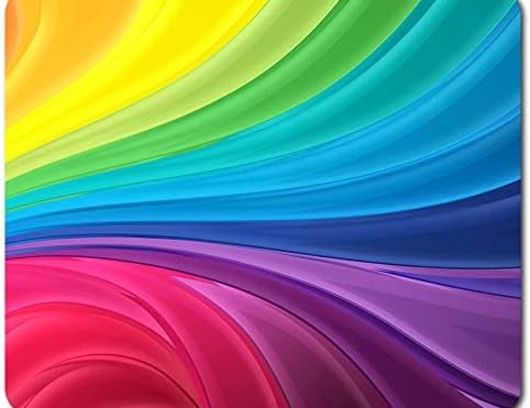
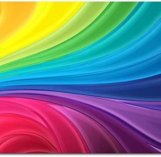
In a world filled with visual stimuli, personal branding photography has become a crucial element in making a lasting impression. Think of it as your digital handshake – that crucial first impression that could either make or break a potential client or customer's perception of you. Use colour in your visual marketing to your advantage.
Why is colour so important in your visual marketing?
Colours have this amazing ability to simulate:
Emotions and traits.
how your audience perceives your brand
Your values
Establishing Visual Identity
Red: Passion and Energy
Once you have chosen your brand colours. Keep your colours consistent in your visual marketing. Not only this is visually appealing but it also reinforces your brand values and the emotions you want your target audience to feel. Think about it, all the big companies do this. What colours come to mind when you think of Coca-Cola?
Consider your target audience. What colors resonate with them? If you're targeting a younger, tech-savvy crowd, bold and vibrant colors might speak their language. On the other hand, a more mature audience might appreciate sophisticated and muted tones.
Audience Connection
Emotion: Red is the color of passion and excitement. It can evoke strong emotions and a sense of urgency.
Trait and Feeling: Bold, dynamic, and energetic. Red is attention-grabbing and commands focus.
Values: Often associated with courage, warmth, and love.
Perceptions: Red can convey a sense of strength, power, and determination. It's a great choice for brands that want to make a bold statement.
Blue: Trust and Calmness
Emotion: Blue is calming and soothing. It brings a sense of tranquility and trust.
Trait and Feeling: Trustworthy, professional, and serene. Blue is often linked to stability.
Values: Conveys reliability, dependability, and a sense of security.
Perceptions: Blue is a go-to for brands aiming for professionalism and dependability. It's also associated with technology and the corporate world.
Green: Freshness and Growth
Emotion: Green is associated with nature, bringing a sense of calm and freshness.
Trait and Feeling: Balanced, harmonious, and growth-oriented. Green represents renewal and vitality.
Values: Symbolizes health, wealth, and environmental consciousness.
Perceptions: Green is often linked to eco-friendly and sustainable brands. It can also convey a sense of growth and innovation.
Yellow: Happiness and Positivity
Emotion: Yellow is the color of sunshine and joy. It radiates positivity and happiness.
Trait and Feeling: Cheerful, optimistic, and energetic. Yellow is attention-grabbing in a friendly way.
Values: Represents warmth, friendliness, and creativity.
Perceptions: Yellow can evoke a sense of playfulness and approachability. It's a great choice for brands that want to be seen as friendly and welcoming.
Orange: Energy and Creativity
Emotion: Orange is a vibrant and energetic color, radiating warmth and enthusiasm.
Trait and Feeling: Friendly, energetic, and creative. Orange is attention-grabbing without being too intense.
Values: Symbolizes adventure, creativity, and sociability.
Perceptions: Orange is often used by brands wanting to portray a sense of fun and energy. It can be inviting and approachable.
Pink: Compassion and Playfulness
Emotion: Pink is a color associated with sweetness, romance, and playfulness.
Trait and Feeling: Delicate, nurturing, and playful. Pink has a soft and calming effect.
Values: Represents love, compassion, and tenderness.
Perceptions: Pink is often used in industries related to beauty, fashion, and wellness. It can convey a sense of femininity and sweetness.
Purple: Luxury and Sophistication
Emotion: Purple exudes a sense of luxury, elegance, and mystery.
Trait and Feeling: Regal, sophisticated, and creative. Purple has a touch of mystique.
Values: Represents creativity, wisdom, and luxury.
Perceptions: Purple is often associated with high-end brands and products. It can convey a sense of exclusivity and creativity.
Beige: Warmth and Neutrality
Emotion: Beige is a warm and inviting color, evoking a sense of comfort and coziness.
Trait and Feeling: Soft, understated, and comforting. Beige is soothing and gentle.
Values: Represents simplicity, warmth, and approachability.
Perceptions: Beige is often associated with natural materials and earthy tones. It can convey a sense of warmth and homeliness, making it a popular choice for brands aiming for a welcoming and down-to-earth image.
Brown: Earthiness and Reliability
Emotion: Brown is a warm and earthy color, connecting with the natural world.
Trait and Feeling: Warm, stable, and reliable. Brown has a grounded and down-to-earth quality.
Values: Represents reliability, resilience, and connection to nature.
Perceptions: Brown is often associated with brands that emphasize authenticity and durability. It can convey a sense of warmth and reliability, making it suitable for products or services grounded in tradition and quality.
Black: Sophistication and Mystery
Grey: Sophistication and Balance
Emotion: Grey is a neutral color that exudes sophistication and stability.
Trait and Feeling: Elegant, timeless, and balanced. Grey is calm and composed.
Values: Represents intelligence, composure, and adaptability.
Perceptions: Grey is a versatile color that can be both formal and modern. It's often used in minimalist designs to create a sense of sophistication and professionalism. Grey can also convey a feeling of balance and neutrality, making it suitable for brands that aim to appear trustworthy and reliable.
Emotion: Black is often linked with sophistication and mystery. It can evoke a sense of depth and intrigue.
Trait and Feeling: Elegant, powerful, and authoritative. Black carries a timeless and classic quality.
Values: Represents formality, strength, and independence.
Perceptions: Black is a versatile color that can be associated with luxury, professionalism, and a sense of seriousness. It's commonly used in high-end fashion and upscale brands.
White: Purity and Simplicity
Emotion: White symbolizes purity and simplicity. It brings a sense of cleanliness and freshness.
Trait and Feeling: Pure, clean, and serene. White is minimalist and often associated with clarity.
Values: Represents innocence, simplicity, and new beginnings.
Perceptions: White is timeless and can convey a sense of openness. It's often used in healthcare, technology, and lifestyle brands to evoke a feeling of simplicity and purity.
Gold: Opulence and Luxury
Emotion: Gold exudes opulence, radiating a sense of wealth and luxury.
Trait and Feeling: Elegant, extravagant, and prestigious. Gold is associated with grandeur and abundance.
Values: Represents wealth, prosperity, and success.
Perceptions: Gold is often used to convey a premium and high-quality experience. It's frequently associated with luxury brands and can create a feeling of exclusivity and success. Incorporating gold into your branding can elevate the perceived value of your products or services.
Silver: Modernity and Elegance
Emotion: Silver exudes a sense of modernity and sophistication, reminiscent of the sleekness of metal.
Trait and Feeling: Sleek, futuristic, and refined. Silver is associated with innovation and luxury.
Values: Represents innovation, progress, and exclusivity.
Perceptions: Silver is often used to convey a high-tech or futuristic vibe. It can symbolize innovation and cutting-edge technology. Additionally, silver can evoke a sense of elegance and prestige, making it a popular choice for luxury brands and products. Incorporating silver into your branding can add a touch of modernity and elevate the perceived value of your offerings.